
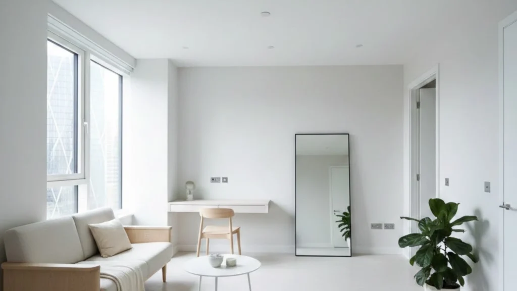
You bought your first property six months ago. A studio flat in Canary Wharf. Compact but perfectly formed. Twenty eight square metres total. Everything you need in one clever space. Kitchen in one corner, sleeping area defined by where you positioned the bed, living space where the sofa faces the window. Cosy. Manageable. Affordable.
The flat needed redecorating when you moved in. Magnolia walls throughout. Boring but neutral. You wanted something with more personality. Something that felt like your space rather than the previous owner’s beige box. So you researched colour psychology, browsed Instagram for studio flat inspiration, and settled on a sophisticated palette you’d seen in an interior design magazine. Deep teal on the main walls. Charcoal grey on the feature wall behind your bed. Rich, dramatic colours that would make the space feel designed rather than default.
Your painter agreed the colours would look stunning. Arrived Monday with the paint. Completed everything by Wednesday afternoon. Two coats throughout. Beautiful even coverage. The colours looked exactly like the samples when wet. You were genuinely excited to see how it would transform the space once the furniture went back and you could see the finished result.
Thursday morning you moved everything back into position. Stood in the doorway looking at your newly painted studio. And immediately felt your chest tighten slightly because the flat felt smaller than it had before. Noticeably smaller. The deep teal walls seemed to close in around the living space. The charcoal behind the bed made that corner feel cave-like and oppressive. The ceiling, which had been repainted in the same white as before, somehow felt lower now that darker walls met it.
You’d spent money and three days of disruption making your already small studio flat feel genuinely smaller, darker, and more claustrophobic than the boring magnolia it replaced. The colours looked sophisticated. The space felt like a prison cell.
Welcome to the expensive mistake of applying colour theory from spacious rooms to genuinely small spaces without understanding how light, reflection, and visual perception actually work in Canary Wharf studios. Making a small room feel bigger through painting isn’t about choosing trendy colours or copying what works in large rooms. It’s about understanding how colour value, finish sheen, and ceiling treatment interact with natural light levels and room proportions to create the perception of space where physical space is limited.
I’ve spent ten years painting studio flats and small rooms across Canary Wharf and Isle of Dogs. The number of residents who make their compact spaces feel smaller through well-intentioned but completely wrong colour and finish choices is genuinely frustrating because the principles that make small rooms feel bigger are straightforward once you understand them.
Why Do Wrong Colour Choices Make Small Rooms Feel Even Smaller?
The relationship between colour and perceived room size isn’t subjective or mysterious. It’s based on how human visual perception processes light reflection and spatial boundaries.
Dark colours absorb light rather than reflecting it. When light hits a dark wall, most of that light is absorbed by the pigment rather than bounced back into the room. This absorption reduces the overall light level in the space, making it feel dimmer regardless of how much natural light enters through windows. Dimmer spaces feel smaller because our brains associate reduced light levels with enclosed spaces.
Dark colours also create clear visual boundaries where walls meet ceilings and where walls meet other walls. These sharp boundaries define the room’s edges explicitly, making your brain fully aware of exactly where the space ends. In a genuinely small studio, explicitly defining where the space ends emphasizes how little space actually exists.
Light colours reflect light rather than absorbing it. When light hits a pale wall, most of that light bounces back into the room, maintaining higher overall light levels throughout the space. Brighter spaces feel more open because our brains associate higher light levels with larger, more open environments.
Light colours also blur visual boundaries between surfaces. Where a pale wall meets a white ceiling, the transition is subtle rather than sharp. This subtlety makes your brain less certain about exactly where the wall ends and the ceiling begins, creating ambiguity about the room’s boundaries that translates into the space feeling less confined than it physically is.
The Instagram studio flats using dramatic dark colours successfully have something your Canary Wharf studio doesn’t. They have ceiling heights of three metres or more, floor to ceiling windows providing exceptional natural light, or room proportions significantly more generous than typical E14 studio developments. The dark colours work in those spaces because the underlying space is genuinely large enough to absorb the visual compression dark colours create. Your twenty eight square metre studio with two point four metre ceilings and one modest window cannot.
What’s The Difference Between Matt, Satin, and Gloss Finishes In Small E14 Studios?
Sheen level affects perceived room size as significantly as colour value does because sheen determines how much light gets reflected and in which direction that reflection travels.
Matt finish absorbs light and reflects what little it does reflect in scattered directions. The result is a soft, non-reflective surface that feels warm and sophisticated but doesn’t actively contribute to making the space feel bigger. Matt finish in a small room maintains whatever size the room physically is without enhancing or reducing perceived space. Matt finish is neutral regarding space perception.
Satin finish reflects more light than matt and reflects it in a semi-directed way. The result is a gentle sheen that catches light from windows and artificial sources and bounces it back into the room at angles that increase overall light levels without creating distracting bright spots. Satin finish in a small room actively increases perceived space by maintaining higher light levels throughout the day as natural light angles change.
Gloss finish reflects maximum light in highly directed mirror-like reflections. The result is a bright, reflective surface that can double perceived light levels in the right conditions but can also create hot spots and glare that distract from the space itself. Gloss finish in a small room is risky because it amplifies everything including imperfections in the substrate beneath it and creates reflections that can make the space feel busy rather than calm.
For Canary Wharf studios with typical light levels and proportions, satin finish on walls provides the optimal balance. Enough reflection to enhance light levels and create perception of space without the glare and imperfection-revealing properties of full gloss. Matt finish looks sophisticated but doesn’t help with the fundamental challenge of making a small space feel less confined.
Ceiling finish matters even more than wall finish in small rooms. A matt ceiling absorbs light and visually lowers the ceiling height by creating a clear boundary where walls meet ceiling. A satin or soft sheen ceiling reflects light upward and downward simultaneously, creating ambiguity about exactly where the ceiling plane exists and making the vertical space feel taller than it physically measures.
A Real Project: The South Quay Studio Disaster
Studio flat on the fourteenth floor of a South Quay development. Twenty six square metres. One window facing north, providing consistent but not particularly bright natural light throughout the day. Standard two point four metre ceiling height. Typical E14 studio proportions.
The owner wanted the space to feel designed and sophisticated rather than basic. They chose a fashionable palette they’d seen in an interior design feature. Warm terracotta on three walls. Deep forest green on the wall behind the sleeping area. White ceiling. All in matt finish throughout because they preferred the sophisticated non-reflective appearance.
The painter executed everything perfectly. Beautiful even coverage. Clean cutting in. Two full coats throughout. The colours looked exactly like the samples. The finish was flawless. The problem wasn’t execution. The problem was specification.
The room felt dramatically smaller after painting than before. The terracotta walls, while beautiful in isolation, absorbed most of the natural light entering through the north-facing window. The forest green behind the sleeping area made that corner feel genuinely oppressive. The white ceiling, while theoretically correct for maintaining height, created a stark boundary where dark walls met bright ceiling that emphasized how low the ceiling actually was.
The matt finish throughout meant zero light reflection. Every photon of natural light that hit those walls was absorbed rather than bounced back into the space. The overall light level in the studio dropped noticeably compared to the previous magnolia walls despite identical window treatment and identical light bulbs.
The space felt claustrophobic to the point of affecting the owner’s wellbeing. They found themselves avoiding spending time in the flat. Felt genuinely oppressed by the walls. The sophisticated palette had created a space that felt like it was closing in rather than opening up.
We repainted with colours and finishes actually suited to small space realities. Pale warm grey on all walls in satin finish. Not brilliant white, which can feel clinical in small spaces, but a soft warm grey that provides enough colour interest to avoid feeling bland while maintaining high light reflection to keep the space bright.
The ceiling painted in the same pale warm grey as the walls rather than contrasting white. This eliminated the sharp boundary where walls met ceiling, creating visual ambiguity about where walls ended and ceiling began that made the vertical space feel taller than its actual two point four metres.
Satin finish throughout meant light entering through the window bounced around the space rather than being absorbed by matt surfaces. The overall light level increased noticeably despite using a colour rather than pure white.
The studio felt genuinely bigger after the second repaint than it had with the original magnolia because we’d optimized every element specifically for small space perception rather than copying colour schemes designed for larger rooms.
What Painting Techniques Actually Make Small Rooms Look Bigger?
Beyond colour and finish selection, specific techniques enhance perceived space in genuinely small studios.
Continuous colour from walls onto ceiling eliminates the visual boundary that defines room height. Instead of white ceiling meeting coloured walls at a sharp line, the same pale colour continues upward, making your brain uncertain about exactly where the wall ends and ceiling begins. This uncertainty translates into the space feeling taller than it measures.
Painting skirting boards and architrave the same colour as walls rather than contrasting white eliminates horizontal and vertical boundaries that define room edges. The continuous colour makes walls feel like they extend further than they physically do because the boundary markers have been removed.
Avoiding feature walls in different colours prevents the room being visually divided into sections. Feature walls work in large rooms because they create interest across distance. In small studios they simply cut the already limited space into even smaller segments. Continuous colour throughout maintains the maximum perception of unified space.
Using slightly warmer tones rather than cool greys prevents the space feeling clinical despite pale colours. Warm pale greys or soft whites with warm undertones feel comfortable and spacious simultaneously. Cool greys or pure whites can feel institutional in small spaces despite theoretically maximizing light reflection.
Ensuring paint coverage is genuinely even throughout prevents light and dark patches that create visual texture. In small rooms where walls are close to viewing position, any coverage variation is visible and creates visual noise that makes the space feel smaller.
What Should Studio Flat Owners Demand From Small Room Specialists?
Light level assessment before colour selection. They should consider your actual natural light levels and window orientation before proposing colours. If they’re suggesting colours without assessing light conditions, the colours might work in theory but fail in your specific space.
Sheen level discussion as critical as colour selection. If they’re focused entirely on colour without discussing whether matt, satin, or gloss finish suits your space, they’re missing half the equation for perceived size.
Ceiling treatment strategy confirmed. Whether ceiling continues wall colour or contrasts with it affects perceived height dramatically. If they’re automatically proposing white ceiling without discussing alternatives, they might be following convention rather than optimizing for your space.
Sample testing on your actual walls before full painting. Colours look completely different in small low-light studios versus large bright showrooms. If they’re not offering to test samples in situ, you’re guessing how colours will actually appear in your specific conditions.
Make Your Studio Actually Feel Bigger
Small room painting isn’t about copying what works in large spaces. It’s about understanding how colour value, finish sheen, and boundary treatment interact with your specific light levels and room proportions to create perception of space where physical space is limited.
We specialise in studio flats and small rooms across Canary Wharf and Isle of Dogs. We assess your actual light conditions. We specify colours and finishes based on your space rather than general theory. We test samples in situ before committing. And we produce results that make genuinely small spaces feel as open as their physical limitations allow.
Call for quote now: 07507 226422 Email: hello@havenedge.co.uk Website: www.havenedge.co.uk
CSCS certified, fully insured, experienced with small room painting across E14 including studio flats, compact bedrooms, and genuinely challenging proportions. Your studio deserves colour and finish choices based on what actually works in small spaces rather than what looks good in magazine features of large rooms.